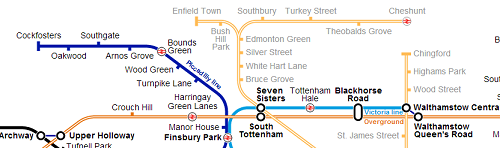
A few weeks ago, Tube Challenge World Record Holder, Geoff Marshall, came up with the brilliant idea of renaming all of London’s 270 tube stations with other plausible names. He made the request via the Londonist, and I suspect got a few more responses than he was expecting.
He’s now sifted through the more than 300 comments and distilled them into the map above. Having walked to all of them, I think he’s done a pretty good job selecting the new names, although I do have a few disagreements. I made the following suggestions and am happy to see that several (in bold bellow) made the cut.
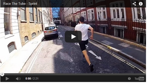
If you haven’t already watched the video above, do it now! It solves the age old question: “Can someone actually run faster than a tube train?” Want to find if they can?
Then watch as James Heptonstall races a circle line train between Mansion House and Cannon Street while his friend Noel Carroll stays on-board and films the dramatic conclusion.
Update: For an even more impressive feat watch as the same duo complete the even more ambitious run from Moorgate to St. James’s Park to beat the train. Not to take anything away from achievement, but it should be noted they don’t follow the circle route directly, but instead take the most direct route. Still pretty incredible it can be done.
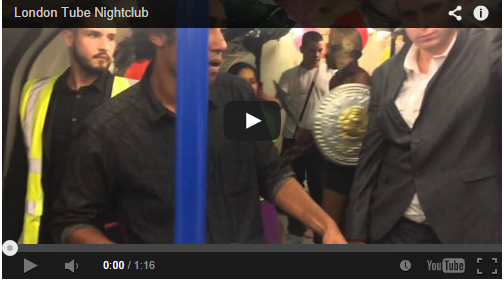
Here’s something you probably don’t see on your daily commutes, a nightclub on the Tube. The prank seems to have been created by Trollstation and the video above was caught on camera by reddit user BurnSpeed.
You can watch the full video below, including when the police show up:
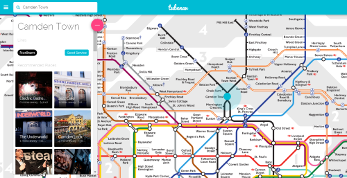
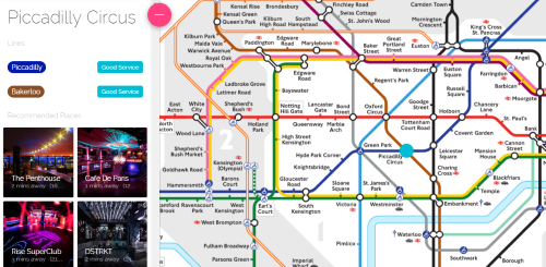
So when Daniel Botcherby, a former co-worker of mine, got in touch and said he’d created something different using the Tube map, I have to admit I was somewhat skeptical. However, Tubenav is actually really cool.
Basically, it claims to be the first fully interactive Tube Map, which you can use to find local businesses close to any of London’s Underground stations. And yes, they’ve licensed the map from TFL.
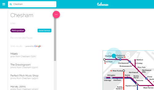
I found using the web app relatively straightforward and it worked well for me on both my laptop and my mobile. All the stations I checked seemed to have listing; surprisingly even far flung ones such as Chesham (not even in London):
However, the web apps’ real strength lies with listings in central London:
Since I’m a fan of both the Tube and entrepreneurship, I thought I’d let Daniel (Tubenav’s COO) explain it in his own words. I sent him nine questions by e-mail and here are his responses:
1) Where did the idea for the app come from?
Well, it all started from the idea that there’s a huge innovation gap we’re seeing in the transport system. We’ve got hybrid buses, oyster cards, contactless payments, journey mapping api’s with live transport information but we’re still using the same static Tube Map! It’s a fantastic design that we all know and love but we really wanted to do more with it!
2) Who should use the app?
I think if you’re new to London or a tourist looking to get around the city – This app is for you. For tourists we can help you navigate to your hotel and get you used to that area with what’s around you worth checking out.
When you start moving around the city, our web app lets you simply search for places you want to go to and how to get there and we even help you discover new and exciting things to do to get you used to the city.
3) Why use this app over other alternatives (e.g. Google Maps, Yelp, Foursquare, etc.)?
We are combining the best elements of Google Maps and Foursquare with the best discovery elements of Yelp, Timeout and Yplan! We have a superior directory of places than Google Places – with more relevant content and a far more user friendly experience. We’ve combined searching and navigating to a place within two clicks – so you don’t have to bounce between all these apps that only serve one piece of the puzzle of how to get to somewhere!
4) Where are you getting you ‘recommended places’ data from?
We spent a year researching the best places in the capital and in addition to that we have 3 years of data from a previous venture. So this formed the basis of our recommended places – and with London changing as rapidly as we add the data, we’ve got a team of tastemakers with their ear to the ground so that we can be the real-time provider of what’s going on in the city.
5) How is the app going to make money?
Right now our focus is to provide the best experience possible to our Tubenav community. We want to provide you, if you’re new to London or even if you think you know-it-all, something of value and show you how exciting London is.
Just the other day I was invited to a break-dance event which was absolutely incredible but there was not nearly enough people as I would have imagined for the quality of the dancers, it’s these kind of fresh events that go under the radar that we will be bringing to the forefront to highlight London’s diverse cultural heritage.
6) When can we expect iPhone and Android versions of the app?
This is happening soon – we’re currently raising funding through Seedrs to help us get to this stage and beyond. In the meantime our web app is fully optimised for your mobile phone and tablets.
7) Was it difficult/expensive to license the map from TFL?
Yes! TFL have a great team in charge of who they let and don’t let use their map and we went through several stages of approval before we were even authorised to fully build our working prototype. We’re a brand new case for them since we’ve built London’s first fully interactive Tube Map, and we’re proud to have that relationship.
8) What new features do you plan on adding in the future?
In line with our idea of making London Real-Time… we’ll be launching something called ‘Hot Spots’ and these will be beacons flashing on the Tube Map that will alert you to the ‘hottest’ things happening in London and even some free giveaways! So definitely keep an eye out for that!
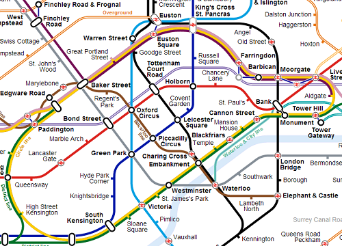
You’ll want to click on the map above to see a full resolution version
The map above was created by Brian Butterworth at Uk Free TV and is an attempt to include all current and future planned upgrades to TFL’s services on one map.
On first glace it looks a bit of a mess. However, looking a little closer you’ll find a few interesting things such as:
High usage stations have a slightly larger font size and are highlighted in yellow.
Stations outside of Greater London are shown with a lighter text colour.
The Map includes Crossrail 1 & 2, High Speed 1 & 2, Thameslink, the R25 and even the Northern City Line but not the current Tram services in South London or the Emirates Air Line.
Distances between out-of-station interchanges are shown
A slew of new stations have been added including: Battersea, Nine Elms, Cassiobridge, Watford Vicarage Road, Junction Road, Old Kent Road, Camberwell and I’m sure lots more.
Euston-King’s Cross-St. Pancras looks like it will be one crazy interchange station.
The River Lea is included along with the Thames (not sure why)
The Beckton curve is shown on the map
I doubt a map like this would ever be used by TFL as it’s simply too complicated. However, I think Brian has done an incredible job highlighting the issues that TFL will (hopefully) soon have to address. Mainly how much more can you add to the current map before it becomes unreadable.
The genius of Beck’s 1933 Tube Map was that it made everything simple. While the map above uses Beck’s techniques of straight, vertical and 45 degree diagonal lines, there are simply too many of them and geographical accuracy is further sacrificed. When all these services do open, it will take another genius like Beck to help use navigate our way around them. Until then, this is a great attempt in my opinion.
The map above was created by reddit user midandfeed and is an attempt to show what the tube map might look like with Crossrail and the new Overground routes added in. I think it’s a great attempt to solve a rather difficult issue.
While it adds a lot of extra useful information, it comes somewhat at the expense of readability. I’m not sure how TFL is going to solve the issue of putting ever more lines onto the tube map. It’s difficult to see how it will end up being much different from the one above.
Yet, as with all tube maps, geographical accuracy is sacrificed for improved readability. One example, pointed out on reddit, is that Willesden Junction and North Acton look very far apart, but are in reality are only about a mile away from each other.
Another minor issue is that the Croxley Rail Link is not included. This will open before Crossrail and so should be there. The Northern Line extension to Battersea is also not included, but is likely to open after Crossrail.
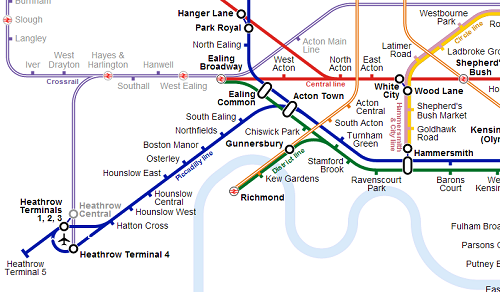
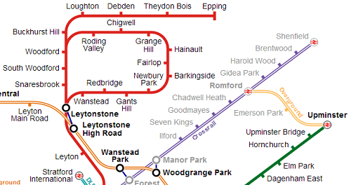
Here are some slightly enlarged views of the map:
View of central London. Notice the new interchanges between Farringdon and Barbican or Moorgate and Liverpool Street. The Waterloo & City line is also more geographically accurate than the current map.
View of how Crossrail will look at Heathrow. I’m not sure about the name, as the Crossrail website lists the name of the station as Heathrow T1, 2, 3 and not Heathrow Central (which is an existing station). Also nice to see the out of station interchange between Hanger Lane and Park Royal.
View of the map in East London. Especially like the 3 stop line between Upminster and Romford. On this map it actually looks useful. Also a few interesting out of station interchanges.
Finally, the new Overground lines in North London. Should be a vast improvement for people living in those areas.
So what do you think of this as a potential map? Notice any glaring problems or omissions? If so let me know in the comment section below:
Several sections look to have more than 4 people standing per square meter during the AM peak. If you already commute into busy hubs like London Bridge, Waterloo, Bank, etc. in the morning, you probably won’t notice a huge difference as trains are already at capacity. However, you may end up spending more of your journey time cheek by jowl with your fellow commuters in 2031.
Some interesting and unexpected bits set to be extremely crowded include:
The Northern line near Kentish Town (not good if I’m still working in the area 17 years from now).
The Central line starting all the way out at Leytonstone (not good if you’re only getting on a Stratford)
The Central line also bizarrely looks set to get a bit busier between Grange Hill and Hainault.
Small sections of the shared Circle, Metropolitan and Hammersmith & City lines between Baker Street and Euston Square and also from Liverpool Street to Aldgate look to be very crowded.
The Metropolitan line also looks to have a small busy section in zone 7 until Moor Park.
The District line looks to be crowded from Putney Bridge to St. James’s Park.
Finally, the Victoria line looks like it will be just as busy as ever.
Other things to note include:
The lack of Overground and Crossrail (which should hopefully be open by 2031) on the map; but the inclusion of the DLR.
Looks like the Metropolitan branch line to Watford Junction has been included (and will thankfully not be too busy) but the Northern line to Battersea has not.
Those living at the ends of most lines will still be able to get a seat in the morning.
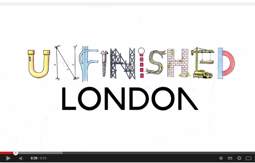
Ever wonder why Mill Hill East station exists? Well in the first episode of the Unfinished London video series, Jay Foreman takes a look at the Northern Heights plan. While the video was originally published over 4 years ago, I’m hoping you may not have seen it. But even if you have, it’s worth a second viewing.
Far from being a boring history lesson, Jay instead looks at the more humorous aspects of London’s quixotic approach to planning. Just a few of the gems you’ll see in the video:
Evidence of a former railway you can see on Google Earth.
Revealing footage of Dr. Beeching.
A bunch of bridges over nothing.
Clues as to where the new line would have gone.
Why a certain useless bus stop exists on the A41.
The Green Belt’s role in all this.
How a poster destroyed the very area it was designed to promote.
Why all houses in suburbia look the same.
What Bushey Heath station might have looked like.
Why any attempt to complete the Northern Heights plan today, would mean Jay’s grandmother would be forced from her home.
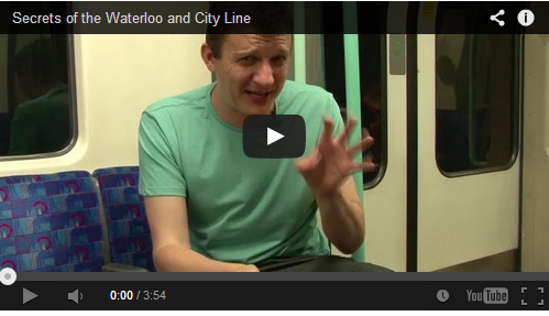
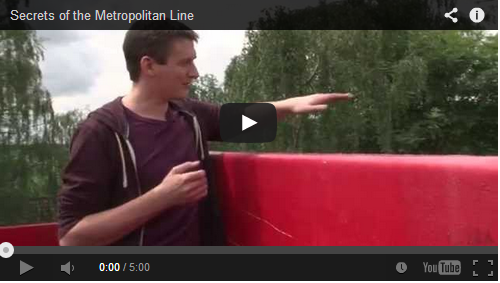
Today is the final Secrets of the Underground video in the series. In this video Geoff Marshall looks at the Waterloo and City Line, the Tube’s shortest. Now you’d think there wouldn’t be too many secrets on such a short line, but Geoff’s been very sneaky and manages to uncover the following:
The duration of a trip between the two ends of the line.
How they get Waterloo & City line trains in and out of the tunnels.
Where you can find a Greathead shield you can walk through.
It’s too bad there aren’t more tube lines to include in this series, but like me perhaps Geoff can now focus on the Overground and the DLR for his next videos.