You’ll want to click on the map above to see a full resolution version
The map above was created by Brian Butterworth at Uk Free TV and is an attempt to include all current and future planned upgrades to TFL’s services on one map.
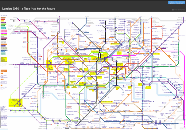
On first glace it looks a bit of a mess. However, looking a little closer you’ll find a few interesting things such as:
- High usage stations have a slightly larger font size and are highlighted in yellow.
- Stations outside of Greater London are shown with a lighter text colour.
- The Map includes Crossrail 1 & 2, High Speed 1 & 2, Thameslink, the R25 and even the Northern City Line but not the current Tram services in South London or the Emirates Air Line.
- Distances between out-of-station interchanges are shown
- A slew of new stations have been added including: Battersea, Nine Elms, Cassiobridge, Watford Vicarage Road, Junction Road, Old Kent Road, Camberwell and I’m sure lots more.
- Euston-King’s Cross-St. Pancras looks like it will be one crazy interchange station.
- The River Lea is included along with the Thames (not sure why)
- The Beckton curve is shown on the map
I doubt a map like this would ever be used by TFL as it’s simply too complicated. However, I think Brian has done an incredible job highlighting the issues that TFL will (hopefully) soon have to address. Mainly how much more can you add to the current map before it becomes unreadable.
The genius of Beck’s 1933 Tube Map was that it made everything simple. While the map above uses Beck’s techniques of straight, vertical and 45 degree diagonal lines, there are simply too many of them and geographical accuracy is further sacrificed. When all these services do open, it will take another genius like Beck to help use navigate our way around them. Until then, this is a great attempt in my opinion.
What do you think?

