How The Proposed London Orbital Railway Would Look On Google Maps

oribital-railway-google-map
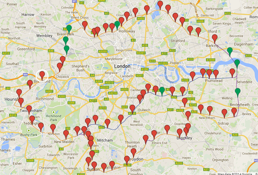
Click on the link for the full interactive Map

For reference, here’s what the various colours mean:

  • Orange Lines – Existing lines
  • Blue Line – Existing lines (going more central)
  • Purple Lines – Lines to be built (a guess)
  • Red Pinpoint – Existing stations
  • Green Pinpoint – Stations to be built (these are also a guess in terms of position)

Seems I’m on a bit of map kick lately. Today I present a map created by reddit user lifeless2011 of how the proposed London Orbital Railway might look on Google Maps.

In case you haven’t heard, Boris Johnson has proposed spending at least £200bn on transport infrastructure, in London, by 2050, as part of a wider £1.3tn infrastructure plan.

The Orbital Railway, already nicknamed the R25, is but one of many projects that will likely not see the light of day. On the bright side, if by some miracle it does get built, I’ll be old enough for a Freedom Pass and will be able to ride it for free.

Why Is London’s Traffic So Bad? Jay Foreman Explains In Unfinished London

In episode 2 of Unfinished London, Jay Foreman tackles the history of the unbuilt ‘Ringways’ that would have surrounded London with not one but four! – M25 style motorways. Fortunately, this idea seemed as insane to Londoners back then as it does to us today.

In his usual comedic style Jay looks at:

  • How London was not designed for the car.
  • How he can run faster than London traffic.
  • The Abercrombie (aka Greater London) plan.
  • Where the Ringways would have gone.
  • Why we only ended up with the M25.
  • The evidence you can see today for the unbilt sections of motorway.
  • Why north London is better than south London.
  • What would have to happen to make the South circular happen today.
  • Why the Westway was built and how its construction helped halt further building.
  • And finally how all this affects our roads and traffic planning today.

So why is London’s traffic so bad? Well to put it simply, Londoners would prefer to have walkable streets and use public transit than drive on large motorways. This may be a pain if you’re a car owner, but it is a far better alternative than the proposed ‘Ringways’ of the 60s and 70s.

For more Unfinished London watch episode 1, episode 3 part 1 and episode 3 part 2.

The 68 Proposed ‘Great Tower(s) For London’ That Would Have Surpassed The Eiffel Tower

Great Tower For London

Click the image above for full height comparison

In 1890 Sir Edward Watkin – a British MP and Chairman of the Metropolitan Railway (now part of London Underground) – held a design competition for the “Great Tower For London” that would have rivaled (or in many cases surpassed) Gustave Eiffel’s tower in Paris. In total 68 designs were submitted. You can see a full height comparison of each design by clicking the image above. (created by reddit user herky140).

The Tower was going to be the centrepiece of an amusement park located in Wembley, which would have served as a tourist attraction to lure rail customers out from central London. The winning design would have been 1,200 feet (366m) tall, over 150 feet (45m) taller than the Eiffel Tower. However, the scheme slowly ran out of money and only ever reached a height of 154 feet (47m).

Thus, the tower was nicknamed Watkins Folly and the London Stump. However, all was not lost as Wembley Park turned out to be rather popular. In 1924 the site was picked as the location for the British Empire Exhibition Stadium, better known today as Wembley Stadium.

You can see some of the other proposed designs below:

Continue reading The 68 Proposed ‘Great Tower(s) For London’ That Would Have Surpassed The Eiffel Tower