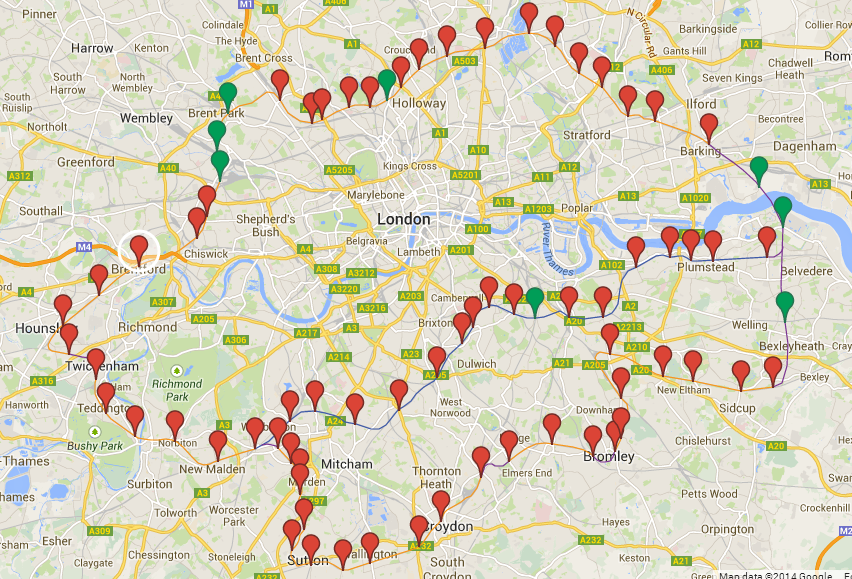
Click on the link for the full interactive Map
For reference, here’s what the various colours mean:
- Orange Lines – Existing lines
- Blue Line – Existing lines (going more central)
- Purple Lines – Lines to be built (a guess)
- Red Pinpoint – Existing stations
- Green Pinpoint – Stations to be built (these are also a guess in terms of position)
Seems I’m on a bit of map kick lately. Today I present a map created by reddit user lifeless2011 of how the proposed London Orbital Railway might look on Google Maps.
In case you haven’t heard, Boris Johnson has proposed spending at least £200bn on transport infrastructure, in London, by 2050, as part of a wider £1.3tn infrastructure plan.
The Orbital Railway, already nicknamed the R25, is but one of many projects that will likely not see the light of day. On the bright side, if by some miracle it does get built, I’ll be old enough for a Freedom Pass and will be able to ride it for free.

