Tubenav: The First Fully Interactive Tube Map

tubenav homeage

Seems every other day I publish another tube map. These can include anything from past London Underground Ghost Stations to What The Tube Map Could Look Like In 2050.

So when Daniel Botcherby, a former co-worker of mine, got in touch and said he’d created something different using the Tube map, I have to admit I was somewhat skeptical. However, Tubenav is actually really cool.

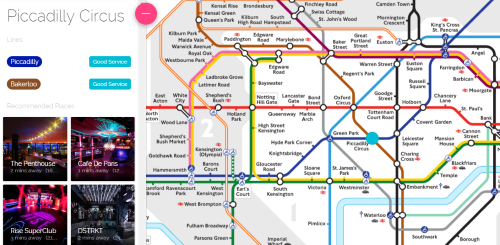
Basically, it claims to be the first fully interactive Tube Map, which you can use to find local businesses close to any of London’s Underground stations. And yes, they’ve licensed the map from TFL.

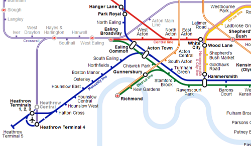
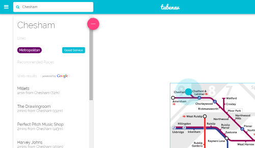
I found using the web app relatively straightforward and it worked well for me on both my laptop and my mobile. All the stations I checked seemed to have listing; surprisingly even far flung ones such as Chesham (not even in London):

chesham tubnav

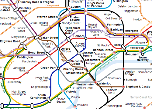
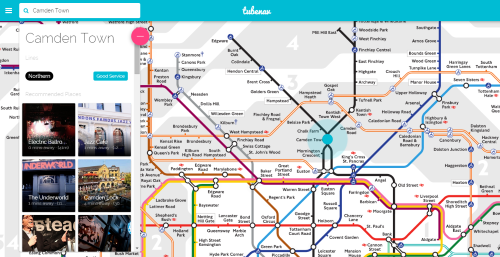
However, the web apps’ real strength lies with listings in central London:

tubenav central

Since I’m a fan of both the Tube and entrepreneurship, I thought I’d let Daniel (Tubenav’s COO) explain it in his own words. I sent him nine questions by e-mail and here are his responses:

1) Where did the idea for the app come from?

Well, it all started from the idea that there’s a huge innovation gap we’re seeing in the transport system. We’ve got hybrid buses, oyster cards, contactless payments, journey mapping api’s with live transport information but we’re still using the same static Tube Map! It’s a fantastic design that we all know and love but we really wanted to do more with it!

2) Who should use the app?

I think if you’re new to London or a tourist looking to get around the city – This app is for you. For tourists we can help you navigate to your hotel and get you used to that area with what’s around you worth checking out.

When you start moving around the city, our web app lets you simply search for places you want to go to and how to get there and we even help you discover new and exciting things to do to get you used to the city.

3) Why use this app over other alternatives (e.g. Google Maps, Yelp, Foursquare, etc.)?

We are combining the best elements of Google Maps and Foursquare with the best discovery elements of Yelp, Timeout and Yplan! We have a superior directory of places than Google Places – with more relevant content and a far more user friendly experience. We’ve combined searching and navigating to a place within two clicks – so you don’t have to bounce between all these apps that only serve one piece of the puzzle of how to get to somewhere!

4) Where are you getting you ‘recommended places’ data from?

We spent a year researching the best places in the capital and in addition to that we have 3 years of data from a previous venture. So this formed the basis of our recommended places – and with London changing as rapidly as we add the data, we’ve got a team of tastemakers with their ear to the ground so that we can be the real-time provider of what’s going on in the city.

5) How is the app going to make money?

Right now our focus is to provide the best experience possible to our Tubenav community. We want to provide you, if you’re new to London or even if you think you know-it-all, something of value and show you how exciting London is.

Just the other day I was invited to a break-dance event which was absolutely incredible but there was not nearly enough people as I would have imagined for the quality of the dancers, it’s these kind of fresh events that go under the radar that we will be bringing to the forefront to highlight London’s diverse cultural heritage.

6) When can we expect iPhone and Android versions of the app?

This is happening soon – we’re currently raising funding through Seedrs to help us get to this stage and beyond. In the meantime our web app is fully optimised for your mobile phone and tablets.

7) Was it difficult/expensive to license the map from TFL?

Yes! TFL have a great team in charge of who they let and don’t let use their map and we went through several stages of approval before we were even authorised to fully build our working prototype. We’re a brand new case for them since we’ve built London’s first fully interactive Tube Map, and we’re proud to have that relationship.

8) What new features do you plan on adding in the future?

In line with our idea of making London Real-Time… we’ll be launching something called ‘Hot Spots’ and these will be beacons flashing on the Tube Map that will alert you to the ‘hottest’ things happening in London and even some free giveaways! So definitely keep an eye out for that!

10) Anything else you’d like to add?

Well, if you liked the sound of what we’re doing, join us on our journey and be a part of London’s history by checking out our Seedrs campaign: https://www.seedrs.com/startups/tubenav And our web app: http://tubenav.com

You can also watch their promotional video here:

So what do you think of Tubenav? Feel free to leave your comments below:

What The Tube Map Could Look Like In 2050

tubemap2050

You’ll want to click on the map above to see a full resolution version

The map above was created by Brian Butterworth at Uk Free TV and is an attempt to include all current and future planned upgrades to TFL’s services on one map.

On first glace it looks a bit of a mess. However, looking a little closer you’ll find a few interesting things such as:

  • High usage stations have a slightly larger font size and are highlighted in yellow.
  • Stations outside of Greater London are shown with a lighter text colour.
  • The Map includes Crossrail 1 & 2, High Speed 1 & 2, Thameslink, the R25 and even the Northern City Line but not the current Tram services in South London or the Emirates Air Line.
  • Distances between out-of-station interchanges are shown
  • A slew of new stations have been added including: Battersea, Nine Elms, Cassiobridge, Watford Vicarage Road, Junction Road, Old Kent Road, Camberwell and I’m sure lots more.
  • Euston-King’s Cross-St. Pancras looks like it will be one crazy interchange station.
  • The River Lea is included along with the Thames (not sure why)
  • The Beckton curve is shown on the map

I doubt a map like this would ever be used by TFL as it’s simply too complicated. However, I think Brian has done an incredible job highlighting the issues that TFL will (hopefully) soon have to address. Mainly how much more can you add to the current map before it becomes unreadable.

The genius of Beck’s 1933 Tube Map was that it made everything simple. While the map above uses Beck’s techniques of straight, vertical and 45 degree diagonal lines, there are simply too many of them and geographical accuracy is further sacrificed. When all these services do open, it will take another genius like Beck to help use navigate our way around them. Until then, this is a great attempt in my opinion.

What do you think?

What The Tube Map Could Look Like With Crossrail and New Overground Lines Added (Unofficial)

London Underground Overground DLR Crossrail map
Click on map for a readable version

The map above was created by reddit user midandfeed and is an attempt to show what the tube map might look like with Crossrail and the new Overground routes added in. I think it’s a great attempt to solve a rather difficult issue.

While it adds a lot of extra useful information, it comes somewhat at the expense of readability. I’m not sure how TFL is going to solve the issue of putting ever more lines onto the tube map. It’s difficult to see how it will end up being much different from the one above.

Yet, as with all tube maps, geographical accuracy is sacrificed for improved readability. One example, pointed out on reddit, is that Willesden Junction and North Acton look very far apart, but are in reality are only about a mile away from each other.

Another minor issue is that the Croxley Rail Link is not included. This will open before Crossrail and so should be there. The Northern Line extension to Battersea is also not included, but is likely to open after Crossrail.

Here are some slightly enlarged views of the map:

central-london-crossrail-map

View of central London. Notice the new interchanges between Farringdon and Barbican or Moorgate and Liverpool Street. The Waterloo & City line is also more geographically accurate than the current map.

heathrow-on-crossrail-map

View of how Crossrail will look at Heathrow. I’m not sure about the name, as the Crossrail website lists the name of the station as Heathrow T1, 2, 3 and not Heathrow Central (which is an existing station). Also nice to see the out of station interchange between Hanger Lane and Park Royal.

east-london-on-crossrail-map

View of the map in East London. Especially like the 3 stop line between Upminster and Romford. On this map it actually looks useful. Also a few interesting out of station interchanges.

north-london-crossrail-map

Finally, the new Overground lines in North London. Should be a vast improvement for people living in those areas.

So what do you think of this as a potential map? Notice any glaring problems or omissions? If so let me know in the comment section below:

Please Note: The Tube Map is copyrighted by Transport for London (TFL). The map above was not created by TFL and is an unofficial creation. I also did not create the map but am using it from Wikimedia Commons Creative Commons Attribution-Share Alike 4.0 International license.

10 New & Unique Minimalist Artistic Maps Of London

orange-map-of-london

The map above is one of ten new and unique minimalist artistic maps of London created by Project Jefferson; which was founded by two UC Berkeley students, “who wanted — nay, needed — artistic map prints of various cities but could not find any.”

They’ve created unique maps by using OpenStreetMap data and have then combined it with different minimalist artistic techniques.

For example the map above is titled “The Orange Honeysuckle” and is described by the Project Jefferson team as “an exercise in boldness. We dared to paint a red-orange map and contrast it with blues. The Orange Honeysuckle has a very noticeable personality and dares you to make it a centerpiece.

All maps can be downloaded for free as phone wallpapers or you can buy high quality prints from their website here.

Here are the rest of the maps with descriptions provided by the Project Jefferson team.

The Blue Elderberry

blue-map-of-london

“This style evokes that of a nighttime aerial scene over a city. Streets, forests, and parks are the primary items rendered. This style employs a cool-toned color palette, easy to complement with almost any home themes and settings.”

The Showy Phlox

phlox-map-of-london

This high contrast style attempts to portray the feel of looking at a negative of a nighttime aerial photo. However, water areas remain dark to further strengthen the contrast. This beautiful piece makes for a perfect centerpiece in a home.

The Mountain Brome

mountain-map-of-london

The Mountain Brome style melds the old with the new. This style conveys the feeling of looking at an antique parchment map. However, you’ll notice the streets are bold and dark, supplying contrast and balancing the antique-ness with a modern feel.

The Maiden Blue-Eyed Mary

maiden-map-of-london

Looking for a map that carries a wireframe feel? For this style, we took a highly stylized map and stripped it down to its bare bones. Inspired by a 3D wireframe figure, this style utilizes light colors, few solid areas, and many lines. Water areas are filled with a light grid pattern. A fantastic lightweight design piece for a bright home.

The Chocolate Lily

chocolate-map-of-london

The Chocolate Lily is our journey into the abstract. Using just two colors, it highlights the blocks of land bounded by our streets and that make up our cities. This is one of our most striking and versatile styles.

The Aromatic Aster

aromatic-map-of-london

An exercise in color, the Aromatic Aster paints a city into what might resemble capillaries. The color scheme is a tribute to Andy Warhol and one of his famous soup cans.

The Golden Currant

golden-map-of-london

For anyone looking for a more traditional map, the Golden Currant is that. One of the few designs we felt necessary to add labels, this map inspires a certain nostalgia for the old city maps hung on walls during the last century. Simple and light, this is a charming map fit for many occasions.

The Varileaf

varilef-map-of-london

A conservative style, the Varileaf relies on a healthy does of mellow colors while still being able to accent a city’s grid. The roads are the highlight of this style, dark and bold. This is another beautiful map style that is easy to utilize with most home interiors.

The Pacific Madrone

madrone-map-of-london

We went all out trying to achieve this truly antique feel. This has minimal labeling, utilizes a mellow color palette, and embodies strong parchment essences. This style displays its character and history proudly and is sure to turn heads in any rustic setting.

Which is your favourite?

How Crowded Will The Tube Be in 2031? This Map Shows How Bad It Could Get

Projected crowding levels on the tube in 2031
Click for full sized image

Let’s face it, the Tube in 2014 is crowded enough! So how much worse is it likely to get by 2031? Well if the map above from the London Infrastructure Plan 2050: Transport Supporting Paper is to be believed, probably a fair bit worse.

Several sections look to have more than 4 people standing per square meter during the AM peak. If you already commute into busy hubs like London Bridge, Waterloo, Bank, etc. in the morning, you probably won’t notice a huge difference as trains are already at capacity. However, you may end up spending more of your journey time cheek by jowl with your fellow commuters in 2031.

Some interesting and unexpected bits set to be extremely crowded include:

  • The Northern line near Kentish Town (not good if I’m still working in the area 17 years from now).
  • The Central line starting all the way out at Leytonstone (not good if you’re only getting on a Stratford)
  • The Central line also bizarrely looks set to get a bit busier between Grange Hill and Hainault.
  • Small sections of the shared Circle, Metropolitan and Hammersmith & City lines between Baker Street and Euston Square and also from Liverpool Street to Aldgate look to be very crowded.
  • The Metropolitan line also looks to have a small busy section in zone 7 until Moor Park.
  • The District line looks to be crowded from Putney Bridge to St. James’s Park.
  • Finally, the Victoria line looks like it will be just as busy as ever.

Other things to note include:

  • The lack of Overground and Crossrail (which should hopefully be open by 2031) on the map; but the inclusion of the DLR.
  • Looks like the Metropolitan branch line to Watford Junction has been included (and will thankfully not be too busy) but the Northern line to Battersea has not.
  • Those living at the ends of most lines will still be able to get a seat in the morning.

Still want to live here in 2031? Then Read:

Moving to London? The Ultimate Living & Working Guide

Do you think you’ll be better or worse off in 2031? Have your say in the comments section below:

How The Proposed London Orbital Railway Would Look On Google Maps

oribital-railway-google-map
Click on the link for the full interactive Map

For reference, here’s what the various colours mean:

  • Orange Lines – Existing lines
  • Blue Line – Existing lines (going more central)
  • Purple Lines – Lines to be built (a guess)
  • Red Pinpoint – Existing stations
  • Green Pinpoint – Stations to be built (these are also a guess in terms of position)

Seems I’m on a bit of map kick lately. Today I present a map created by reddit user lifeless2011 of how the proposed London Orbital Railway might look on Google Maps.

In case you haven’t heard, Boris Johnson has proposed spending at least £200bn on transport infrastructure, in London, by 2050, as part of a wider £1.3tn infrastructure plan.

The Orbital Railway, already nicknamed the R25, is but one of many projects that will likely not see the light of day. On the bright side, if by some miracle it does get built, I’ll be old enough for a Freedom Pass and will be able to ride it for free.

Map Showing The Most Commonly Spoken Language Other than English by Borough

Map Showing The Most Commonly Spoken Language Other than English by Borough

The map above quite simply shows which language, besides English, has the most speakers in each of London’s 32 boroughs + The City. The map was found via reddit and is based on data from the 2011 UK Census found here (excel spreadsheet; 1mb).

My guess is that you’re probably not shocked by the second languages in the boroughs you’re familiar with, but you may be a bit surprised by others.

I’ve walked all over London and I’m still slightly surprised by the following:

  • French being the second language of the City. Not sure what I expected to be honest.
  • Portuguese being the second language of Lambeth and Spanish being the second language of Southwark, especially given that Portuguese speakers are to the west of Spanish speakers.
  • Despite living in Camden, I’m a little surprised to see Bengali as the second language. If I’d had to guess I would have said Arabic.
  • Greenwich is probably the biggest surprise of all, I would not have thought there would be a big enough concentration of Nepalese speakers to be the second most common language.

And just in case you’re wondering how the numbers breakdown:

  • Polish: 7 boroughs – (Barnet, Bromley, Ealing, Lewisham, Merton, Richmond, and Wandsworth)
  • Turkish: 4 boroughs – (Hackney, Islington, Haringey, Enfield)
  • Bengali: 3 boroughs – (Camden, Newham and Tower Hamlets)
  • French: 3 boroughs – (The City, Hammersmith & Fulham and Kensington & Chelsea)
  • Punjabi: 3 boroughs – (Bexley, Hillingdon and Hounslow)
  • Tamil: 3 boroughs – (Croydon, Kingston and Sutton)
  • Gujarati: 2 boroughs – (Brent and Harrow)
  • Urdu: 2 boroughs – (Redbridge and Waltham Forest)
  • Lithuanian: 2 boroughs – (Barking and Havering)
  • Arabic: 1 borough (Westminster)
  • Nepalese: 1 borough (Greenwich)
  • Portuguese: 1 borough (Lambeth)
  • Spanish: 1 borough (Southwark)

In total, 14 boroughs have second languages from within the EU, 14 boroughs have second languages from countries in the Indian sub-continent and 5 have speakers from elsewhere.

Want to join us in one of the world’s most diverse cities? Then read:

Moving to London? The Ultimate Living & Working Guide

What Did Your Part of London Look Like in The 1890s?

Ever wish you could do a Google Street view of London from the 19th century? Well the National Library of Scotland have done the next best thing! They’ve created a map mashup by overlaying 1890s era Ordnance Survey maps with today’s Google Maps.

Source: National Library of Scotland

It’s fun playing around with it. What did your part of London look like in the 1890s? Or did it even exist at all?

Most of the places I’ve lived in London don’t look like they’d be too different 110 years ago, except that my company is now based in what used to be a pianoforte manufactory (aka a piano factory).

I work in a former piano factory!

Share any interesting findings in the comments section below: