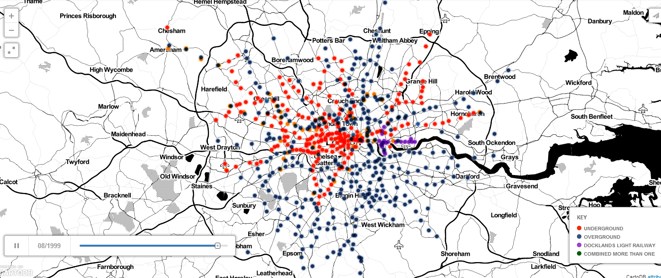
I think the map above is one of the coolest I’ve featured on this site. In just 60 seconds it shows the history and growth of all of London’s rail, tube, DLR network by station opening date.
It was created by Simon Rogers and I found it via reddit. As is typical with maps of this type, people were quick to point out errors. Let me know any you find in the comment section below.
