
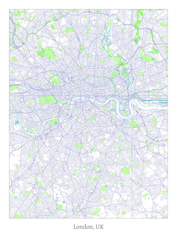
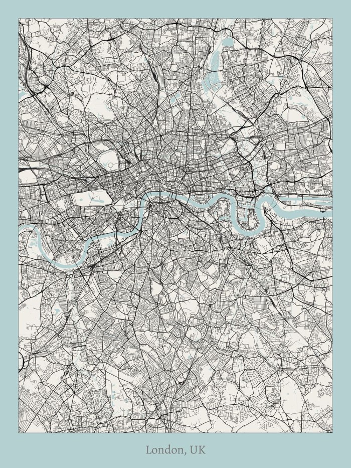
The map above is one of ten new and unique minimalist artistic maps of London created by Project Jefferson; which was founded by two UC Berkeley students, “who wanted — nay, needed — artistic map prints of various cities but could not find any.”
They’ve created unique maps by using OpenStreetMap data and have then combined it with different minimalist artistic techniques.
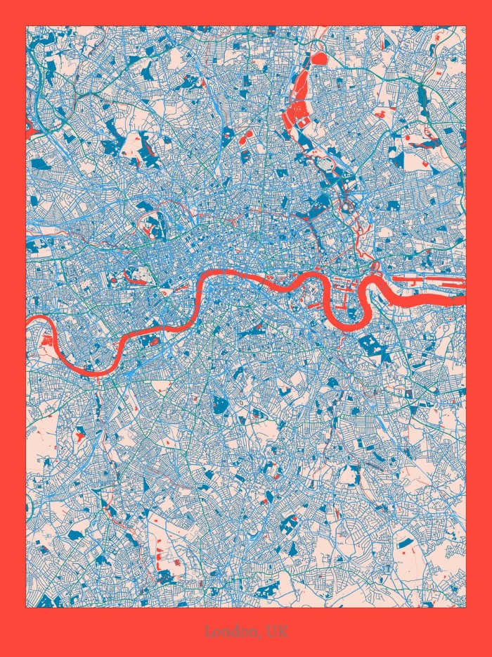
For example the map above is titled “The Orange Honeysuckle” and is described by the Project Jefferson team as “an exercise in boldness. We dared to paint a red-orange map and contrast it with blues. The Orange Honeysuckle has a very noticeable personality and dares you to make it a centerpiece.”
All maps can be downloaded for free as phone wallpapers or you can buy high quality prints from their website here.
Here are the rest of the maps with descriptions provided by the Project Jefferson team.
The Blue Elderberry
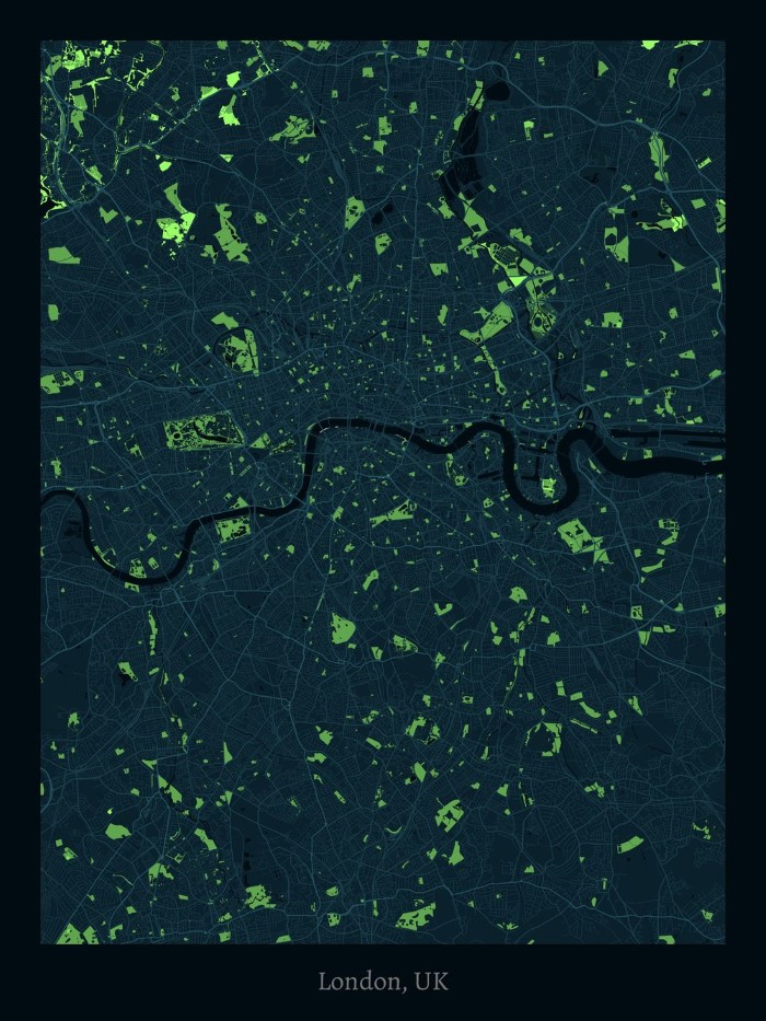
“This style evokes that of a nighttime aerial scene over a city. Streets, forests, and parks are the primary items rendered. This style employs a cool-toned color palette, easy to complement with almost any home themes and settings.”
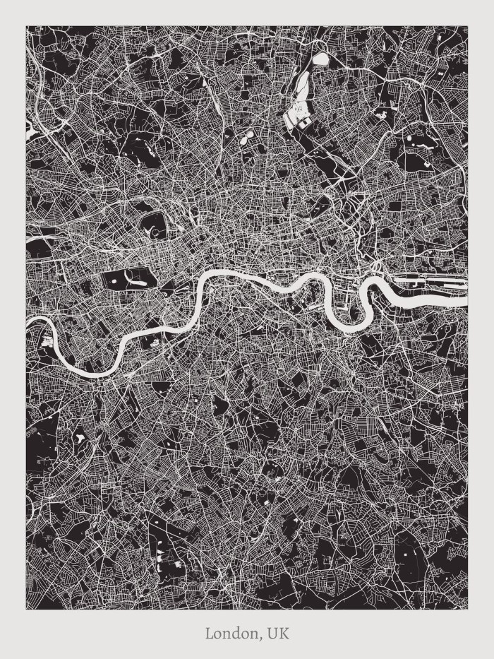
The Showy Phlox
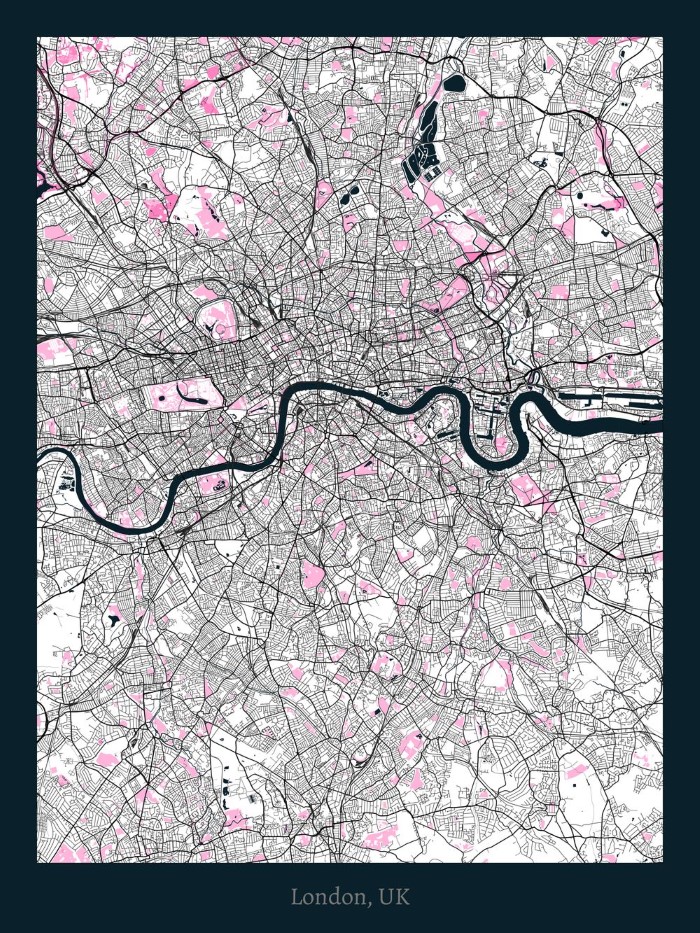
“This high contrast style attempts to portray the feel of looking at a negative of a nighttime aerial photo. However, water areas remain dark to further strengthen the contrast. This beautiful piece makes for a perfect centerpiece in a home.”
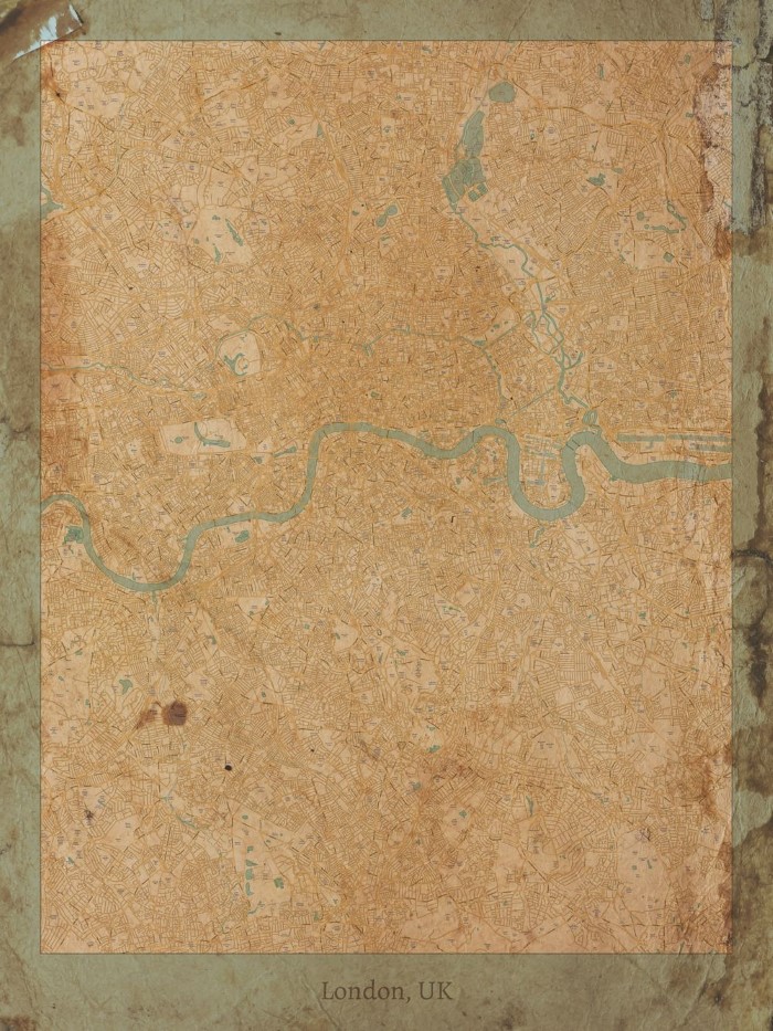
The Mountain Brome
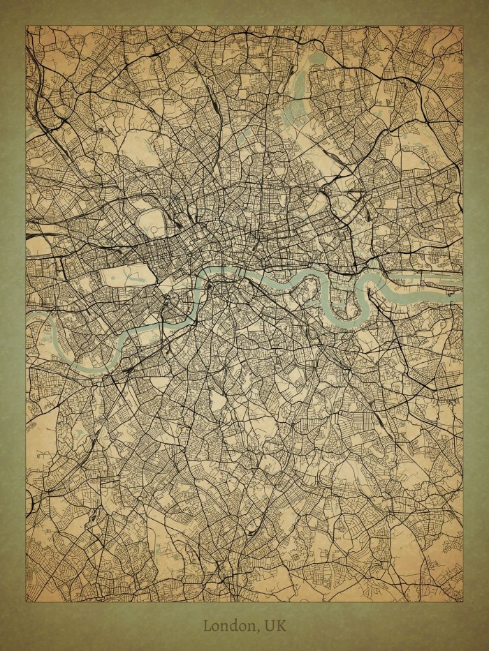
“The Mountain Brome style melds the old with the new. This style conveys the feeling of looking at an antique parchment map. However, you’ll notice the streets are bold and dark, supplying contrast and balancing the antique-ness with a modern feel.”
The Maiden Blue-Eyed Mary
“Looking for a map that carries a wireframe feel? For this style, we took a highly stylized map and stripped it down to its bare bones. Inspired by a 3D wireframe figure, this style utilizes light colors, few solid areas, and many lines. Water areas are filled with a light grid pattern. A fantastic lightweight design piece for a bright home.”
The Chocolate Lily
“The Chocolate Lily is our journey into the abstract. Using just two colors, it highlights the blocks of land bounded by our streets and that make up our cities. This is one of our most striking and versatile styles.”
The Aromatic Aster
“An exercise in color, the Aromatic Aster paints a city into what might resemble capillaries. The color scheme is a tribute to Andy Warhol and one of his famous soup cans.”
The Golden Currant
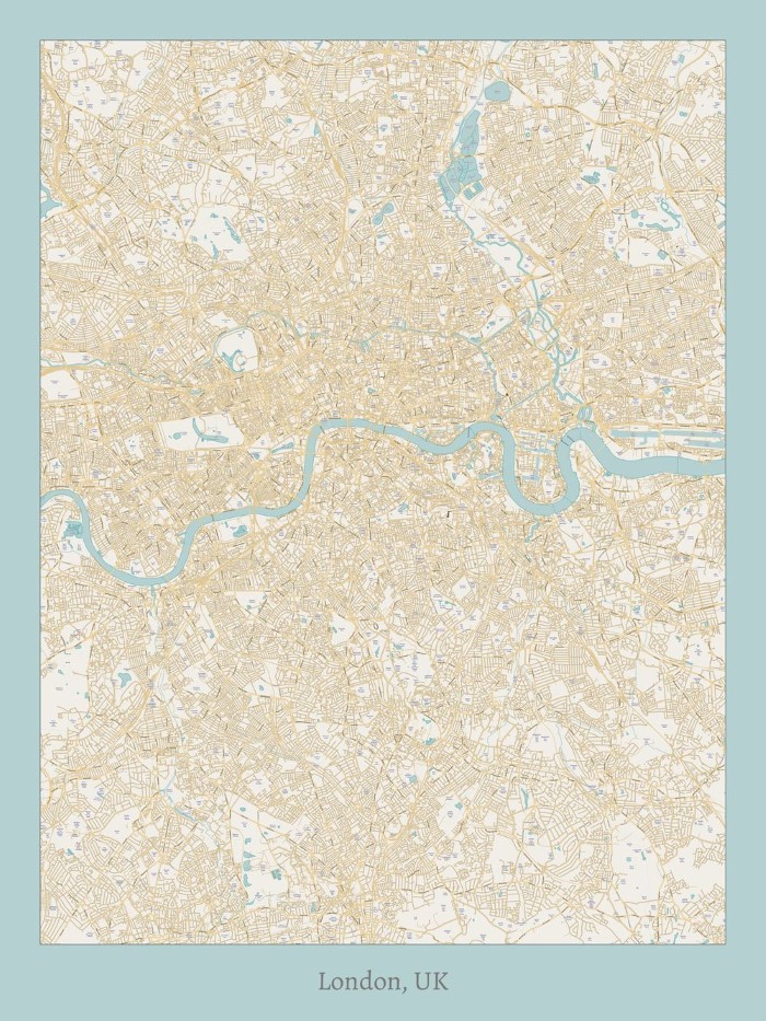
“For anyone looking for a more traditional map, the Golden Currant is that. One of the few designs we felt necessary to add labels, this map inspires a certain nostalgia for the old city maps hung on walls during the last century. Simple and light, this is a charming map fit for many occasions.”
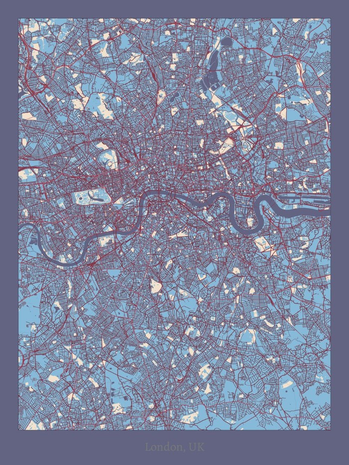
The Varileaf
“A conservative style, the Varileaf relies on a healthy does of mellow colors while still being able to accent a city’s grid. The roads are the highlight of this style, dark and bold. This is another beautiful map style that is easy to utilize with most home interiors.”
The Pacific Madrone
“We went all out trying to achieve this truly antique feel. This has minimal labeling, utilizes a mellow color palette, and embodies strong parchment essences. This style displays its character and history proudly and is sure to turn heads in any rustic setting.”
Which is your favourite?