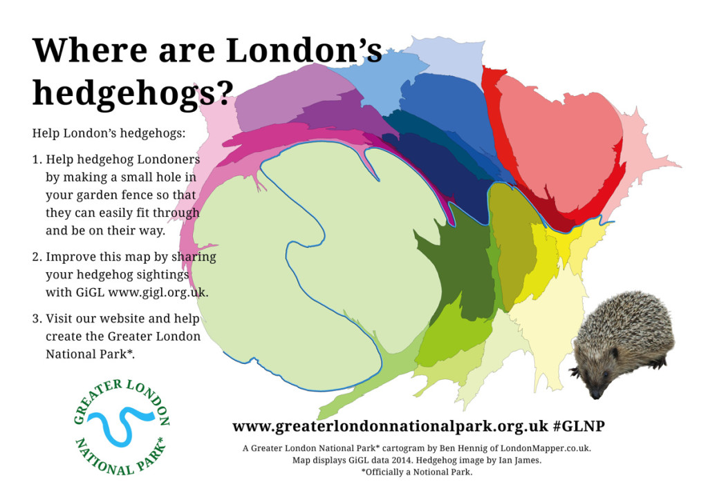
While the Jubilee line may be the youngest, even it has its fair share of secrets. Geoff Marshall shares just a few of the line’s secrets such as the Tube’s most pointless waiting room, where to find a Beatles themed coffee shop, the secret platforms at Charing Cross, the hidden entrance to the Houses of Parliament, and the cinema inside a tube station.
And if you enjoyed that one there’s even more videos:
After a 3 year hiatus, Jay Foreman’s back with his 3rd Unfinished London video. In his latest installment he explains why London has more airports than any other city in the world. Why does London have 6 international airports? New York and Tokyo, which are much bigger than London, seem to manage just fine with only 2 each.
Well it all comes down to money, forward planning, not forward enough planning and semantics as to what actually counts as a “London” airport. Watch the entertaining and informative video above to learn all about how these forces created the crazy airport landscape we see in London today.
And in case you can’t name London’s 6 international from memory here they are in order of how many passengers they carry each year (numbers from 2013):
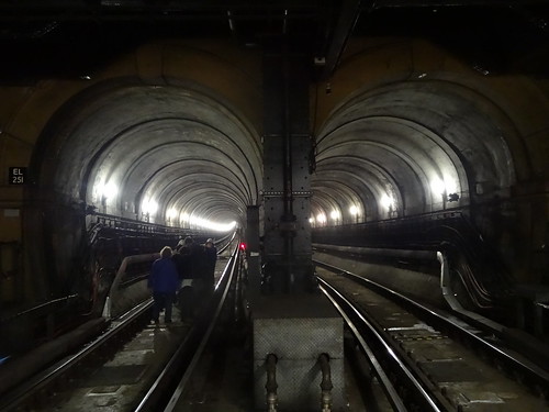
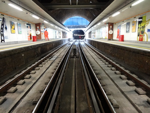
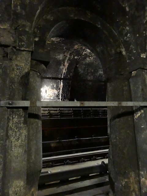
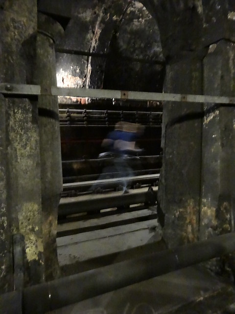
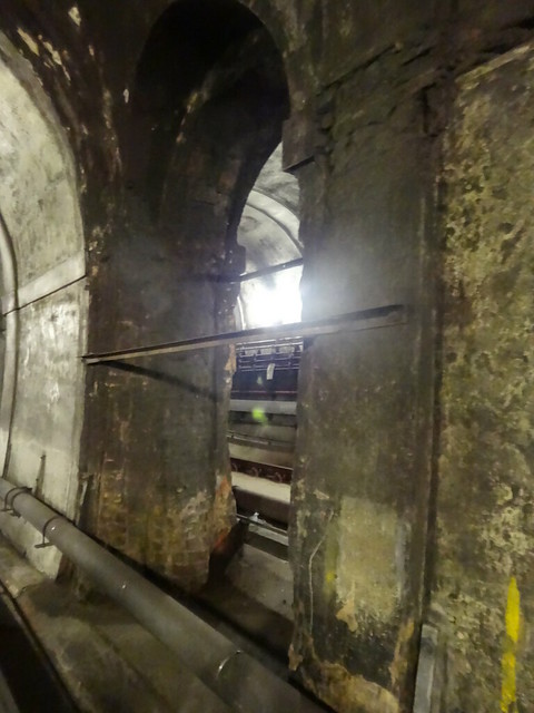
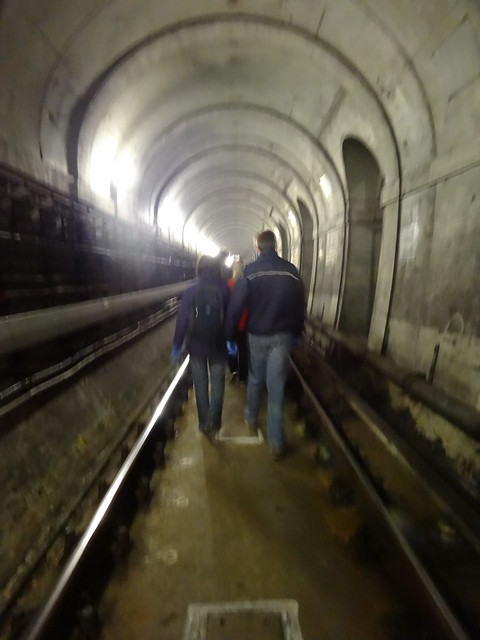
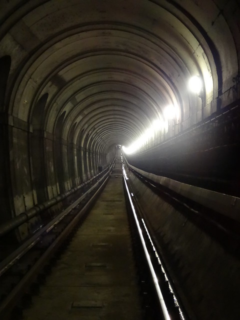
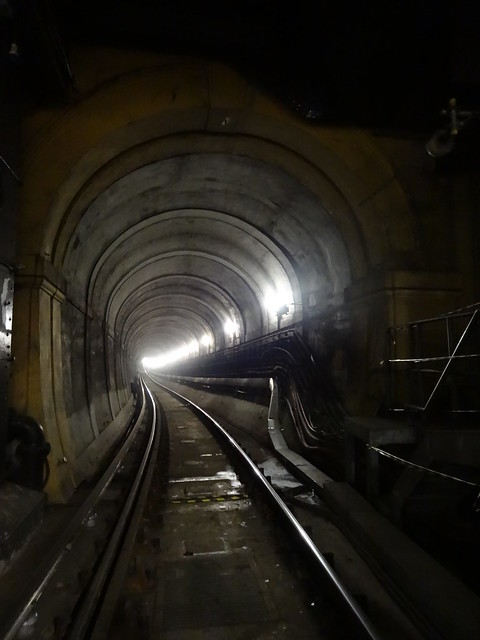
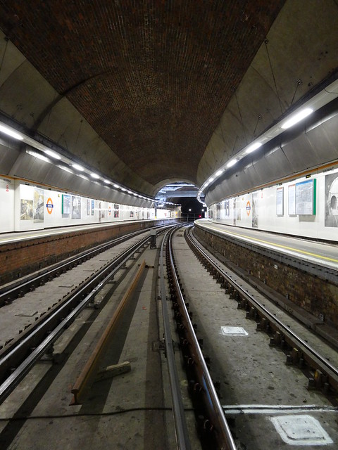
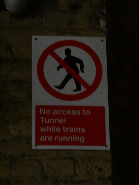
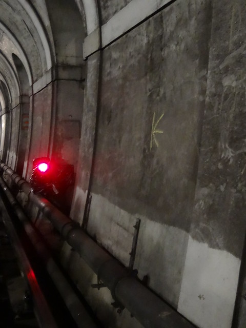
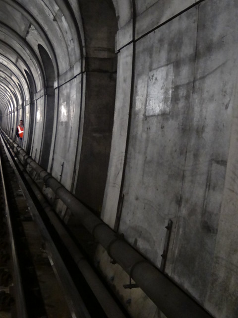
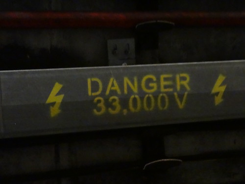
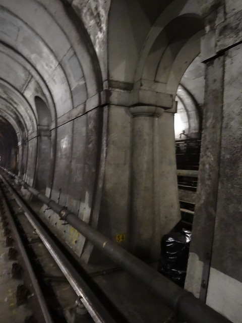
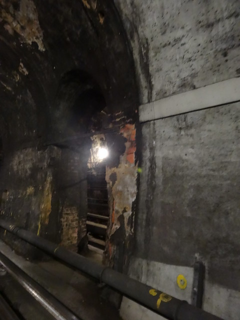
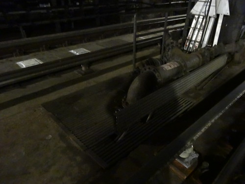
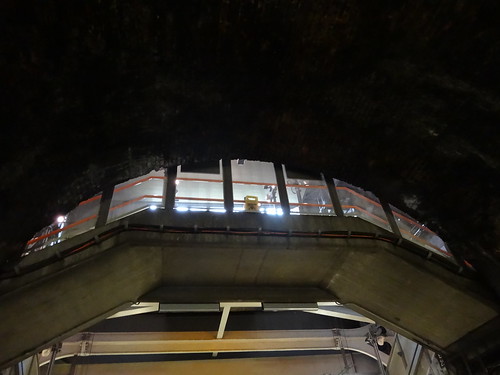
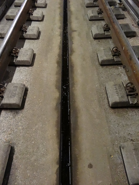
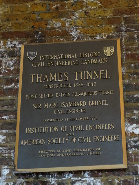
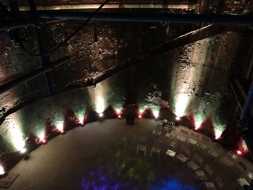
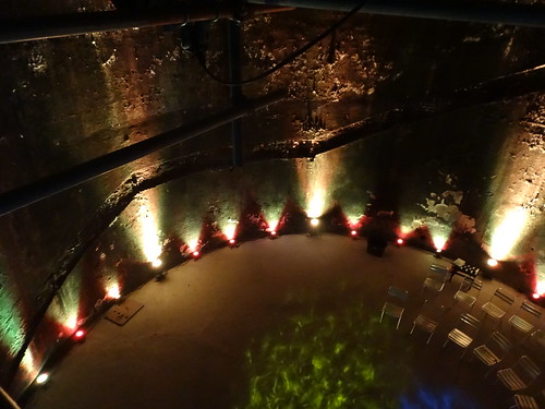
This past bank holiday weekend, I and thousands of other Londoners got a rare opportunity to visit the 8th Wonder of the World: the Brunels’ Thames Tunnel.
Started by Marc Isambard Brunel and completed by his son Isambard Kingdom Brunel, the tunnel finally opened in 1843 after nearly 20 years of work. On top of being the first tunnel under a navigable river, it was also the first underwater shopping arcade and underwater dining hall. And it remains the oldest part of TFL’s infrastructure.
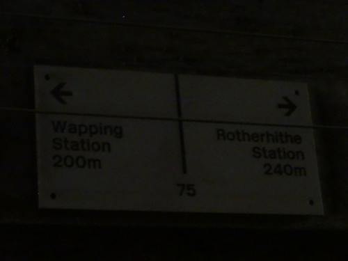
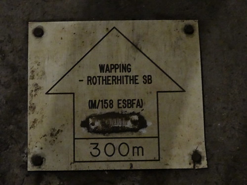
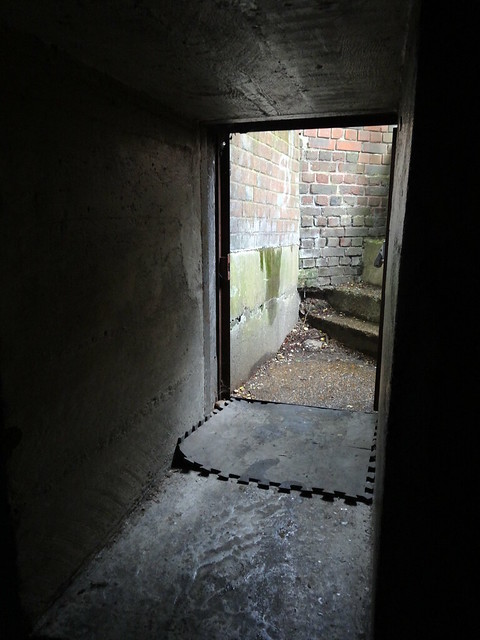
50,000 people are supposed to have walked through the tunnel on opening day in 1843. However, these days it’s a bit more difficult to get access, as it now forms an integral part of the Overground network. Fortunately, a confluence of engineering works allowed myself and others a rare walk through.
This was an extra treat as I’ve previously walked the East London Line above ground and it’s the first time while walking the Underground/Overground that I’ve actually been able walk directly between two stations along the track. You have no idea how times people have asked me if that was how I was doing my walks.
The logo for Madrid’s Metro looks a little similar to the iconic London Underground Roundel. Image Source: Wikimedia Commons
After spending 4 days in sunny Madrid last week, I think got a good feel for the city (friendly people, great food and cheap beer) along with its metro system (Metro de Madrid). While it’s no secret that I’m a huge fan of the Tube, I think there are (at least) 5 ways Madrid’s Metro clearly beats the London Underground.
1. It’s Cheaper
While both have zone systems, pretty much anyway you cut it, Madrid is much cheaper than London. In Madrid, the basic cash fare for the Metro is €1.50 (£1.21), whereas in London, it’s £2.20 (€2.70) for a non-peak zone 1-2 journey paid with Oyster or a whopping £4.70 (€5.80) if the fare is paid in cash.
2. It Has More Lines
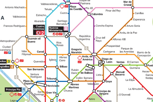
Some of Madrid’s Metro lines. Click for a complete map.
London boasts an impressive 11 underground lines (well 10 if we exclude the two-stop Waterloo & City line). However, Madrid has it’s own two-stop line, along with 12 others. This means that it beats London by 2 whole lines.
3. It Has More Stations
London Underground has 270 stations, which is pretty good until you learn that Madrid has 300. Moreover, until the recent financial crisis, Madrid was adding stations at rate that hasn’t been seen in London for over 60 years. According to Wikipedia (would be great if someone had a better source), Madrid’s Metro added 90 km (56 mi) of track and 80 new stations to the network between 2003 and 2007.
To put this in perspective, it’s roughly equivalent to the length and number of stations found on London’s entire Overground network.
4. It Has Far More Stations Per Capita
What’s even more impressive is that it has far more stations per capita than London. Madrid itself only has a population of 3.3 million compared to the roughly 8.2 million people who live in Greater London.
This means that Madrid has one station per 11,000 people, whereas London has 1 station per 30,370 people.
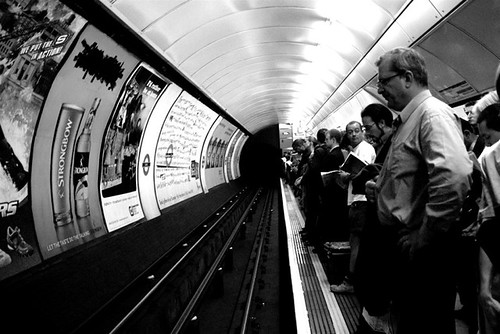
5. It’s Less Crowded
Normal day on the London Underground
Roughly 1.2 billion annual trips were taken on London Underground in 2013 compared to just 558 million taken on Madrid’s Metro. This means that, on average, only half the number of people use the Madrid Metro each day compared to the Underground. Great if you want to get a seat!
So while London still has an older network with significantly more miles of track, Madrid’s Metro stacks up pretty well on most head-to-head comparisons.
A Few Other Random Observations
For some reason the Madrid Metro is left-hand running, which is odd as Spaniards drive on the right. This may be due to the fact that residents of Madrid used to drive on the left until 1924.
The Madrid Metro turns 95 this year, which sounds old until you realise that the Underground is 56 years older.
The Madrid Metro doesn’t currently have a direct line from the City Centre to the main airport. Almost all passengers have to change to another line. While only the Piccadilly line goes to Heathrow, it does pass through central London.
I didn’t see any adverts in the trains themselves. Although you do get ads in the stations and on platforms…
And, most surprisingly, Line 2 of the Metro along with Sol station are both sponsored by Vodafone. And don’t think this can’t happen to London as it’s already being talked about.
These are just a few of the things I noticed in my rather limited interaction with Madrid’s Metro. If you know of anything I’ve missed, other differences and/or interesting features, please tell me about them in the comment section below:
The video above animates London’s amazing growth over the last 2,000 years. See what sites from each of the city’s most important periods are now listed or in some other way protected. For example, did you know that there are more listed buildings from the Georgian period than any other before or since?
Officially titled The London Evolution Animation it was:
The London Evolution Animation (LEA) shows the historical development of London from Roman times to today, using georeferenced road network data brought together for the first time. The animation also visualizes (as enlarging yellow points) the position and number of statutorily protected buildings and structures built during each period.
Do you have a favourite period in London’s history? If so let me know below:
The chart above shows which party has controlled your local London council from 1964-2014, with each square representing one year. Blue is Conservative control, red is Labour control, yellow is Liberal Democrat (formerly Liberal or SDP) control and grey is for when no party holds a majority.
The chart was created by reddit user BlackJackKetchum. Who’s also created a chart to show how many times each council has changed hands:
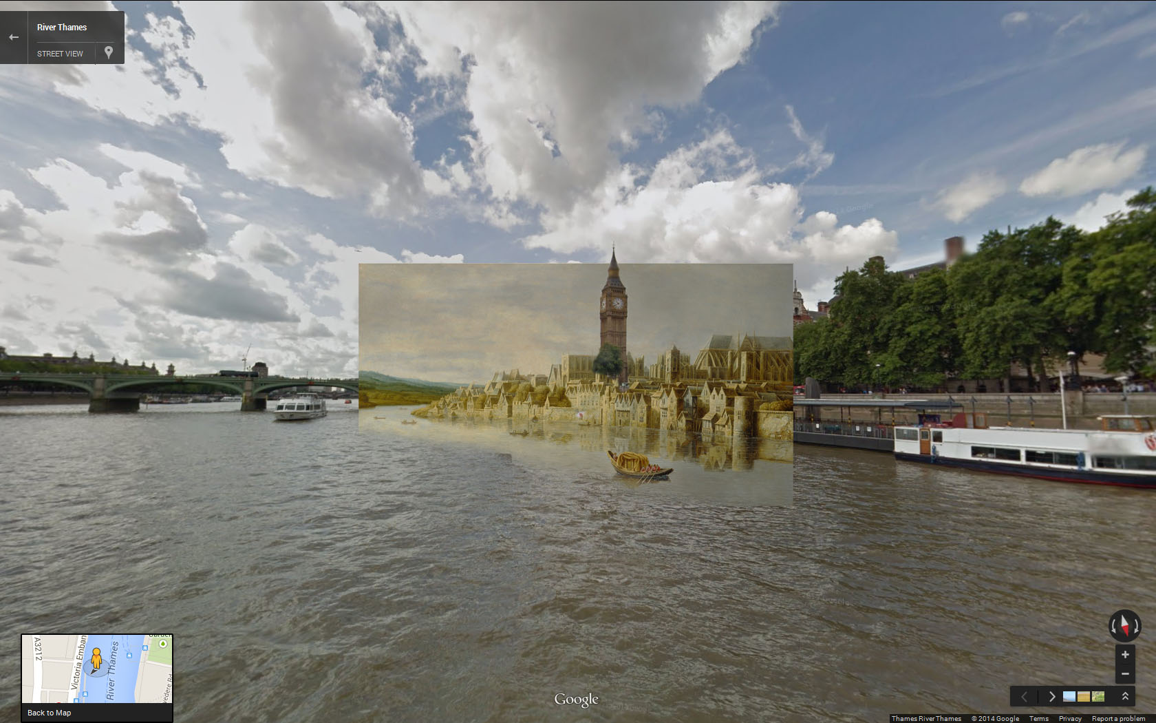
The Thames at Westminster Stairs (1630s) by Claude de Jongh
Halley Docherty (Reddit user halz) has created 15 more stunning images of London by mashing up old paintings and placing them in their modern setting. You can view the original set of images here.
Bread company Warburtons have announced a new central London HQ. Already dubbed by the Londonist as ‘The Loaf,’ the two towers would sandwich the Gherkin on either side. While it is still on the drawing board, it may just become London’s 237th high-rise development.
Do you think they will improve London’s skyline or ruin it? Leave your comments below: